

Project Specs
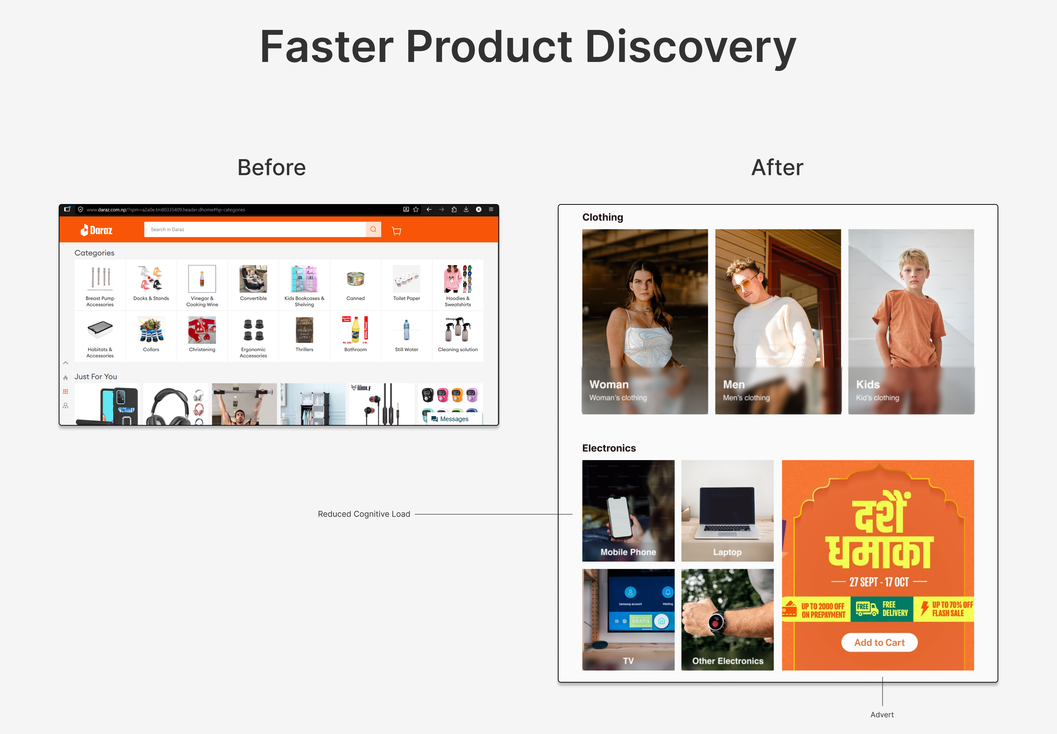
Daraz's homepage was packed with competing promotions, categories, and visual noise that made shopping feel overwhelming. This redesign introduces a cleaner structure, clearer navigation, and stronger content prioritization, turning a cluttered interface into a seamless and user-friendly shopping experience.
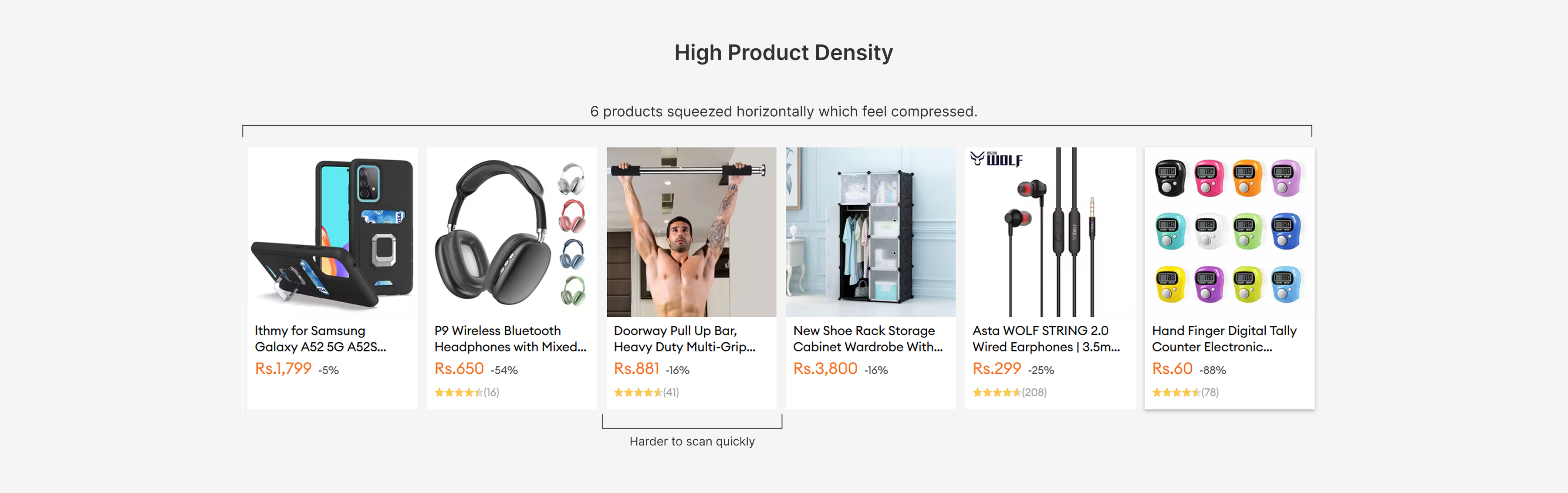
Problem
• Cluttered layout - Overwhelming with too many
promotional banners, offers, and categories.
• Poor product discoverability - Users struggle to find
specific products or categories due to lack of organization and
hierarchy.
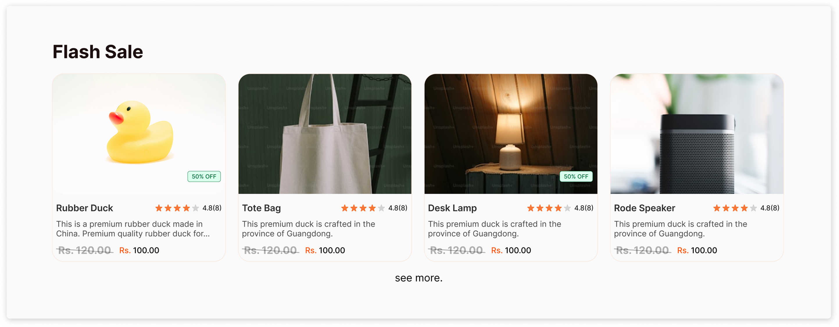
Design Solution
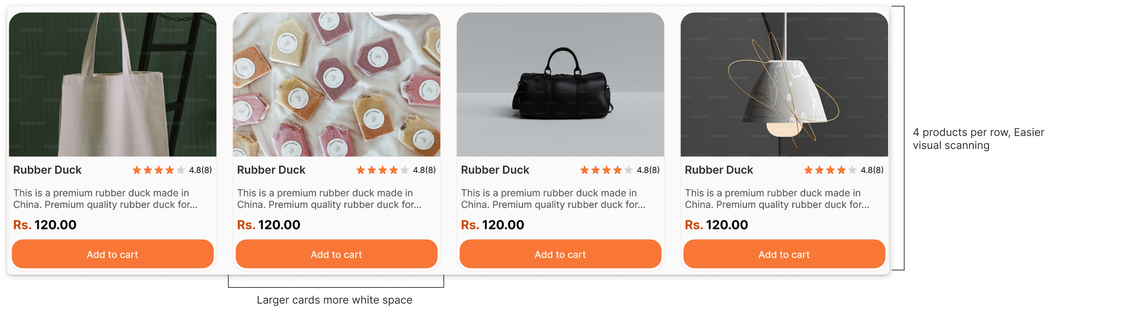
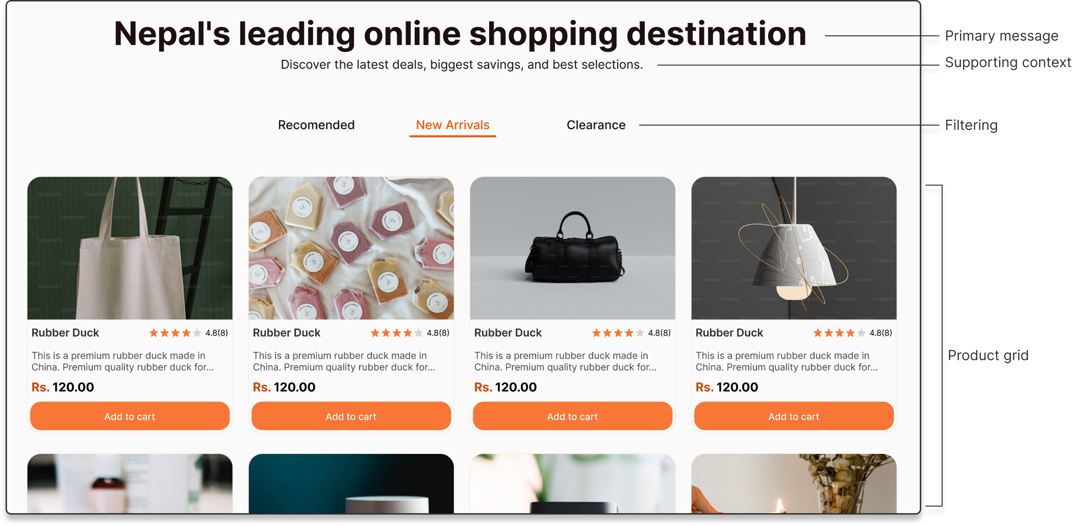
Less information per screen → easier scanning → stronger focus.
Separate categories improve conversion because they reduce friction between wanting something and finding something.
Reflection
The redesign focused on improving information hierarchy and product discoverability. The original interface contained heavily packed feeds, reducing users' ability to process content. These changes improve scanning efficiency and support faster product discovery.